Rundown: Week Ending 12/5/14
 Friday, December 5, 2014 at 05:18PM
 2nd period Design Team
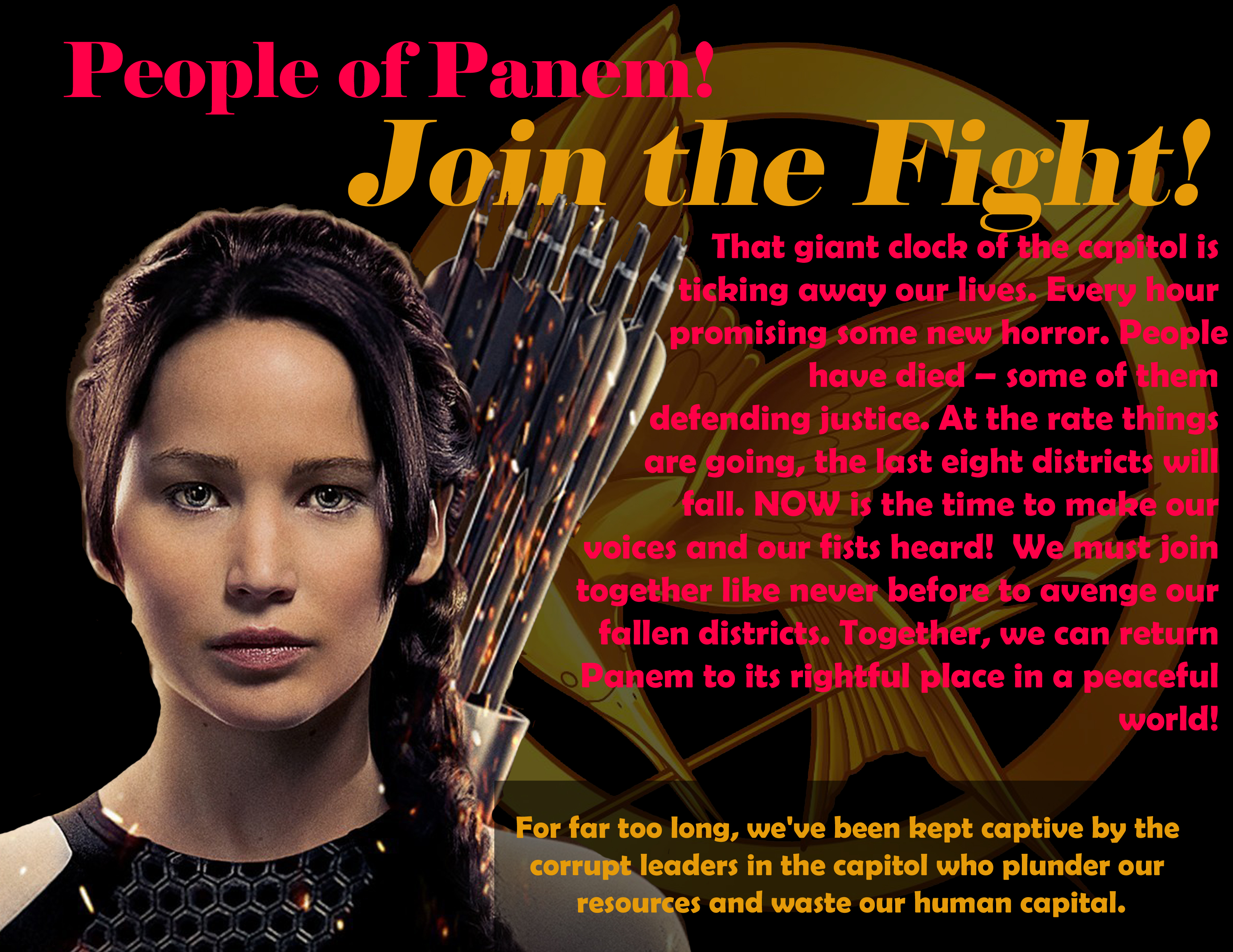
This week, we continued working on making sure our portfolio blogs are up to date. Our work with principles of design focused more on balance in design. Students made animated GIF balance maps of asymmetrical and symmetrical photos and design to post to their blogs. We finished the week with a 30 minutes design challenge that asked students to consider BALANCE, EMPHASIS and typography.

5th and 6th period Graphic Design
This week, we studied LINE as an element of art. Specifically, the 5 types of lines and the idea of implied line (lines created by other lines or other elements of art). Additionally, we discused negative and positive space. To demonstrate learning, students used various lines and a color scheme of their choice to fill the negative space of their artwork with color zentangles. The remaining white space becomes positive space when the viewer reads the student's name or nickname.


Reader Comments