Monday
Nov242014
Using Balance: Hunger Games Propaganda Posters
 Monday, November 24, 2014 at 12:36PM
 Process:
- Make a new document called "2_lastname_hgbalance1" that's letter-sized.
- Use the requirements, constraints, and assets below to create your propaganda poster.
- Create a propaganda poster that shows SYMMETRICAL balance.
- Save and turn in both a JPG and PSD.
- Make another, different poster, "hgbalance2" that shows a careful use of ASSYMETRICAL balance.
Requirements:
- Graphic requirements:
- Your posters must include a headline taken from the below text
- Your posters must include ALL of the remaining text
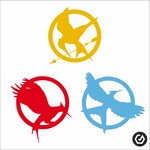
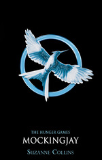
- You posters must use both a photo of Katniss AND a logo from below
- You posters must display a creative and CORRECT use of BALANCE
- Must include the following text:
- People of Panem! Join the Fight!
- For far too long, we've been kept captive by the corrupt leaders in the capitol who plunder our resources and waste our human capital.
- That giant clock of the capitol is ticking away our lives. Every hour promising some new horror. People have died – some of them defending justice. At the rate things are going, the last eight districts will fall. NOW is the time to make our voices and our fists heard! We must join together like never before to avenge our fallen districts. Together, we can return Panem to its rightful place in a peaceful world!
Constraints:
- Document must be letter-sized
- Document must show careful use of BALANCE in elements
- You must only use images and resources from the Assets section below (click to enlarge them)
- You may use additional textures and graphics, but no other images from The Hunger Games, Katniss, or any other characters or movie stills.
Assets:
Thursday
Nov202014
Balance Animated GIF
 Thursday, November 20, 2014 at 12:35PM
 In order to keep our work from looking like random elements thrown on a piece of design, we need to use the principle of BALANCE to make things interesting.
Balance in art and design is how elements of the piece are distributed or how the "weight" of the objects are laid out.
Process:
- Make a new folder called "Balance"
- Online, find a photo of a piece of art or graphic design that you find visually interesting.
- OPEN this photo in Photoshop
- DUPLICATE the background layer.
- On a top layer, draw or create RED outlines around the main objects in the picture.
- MERGE your red outline layers into the top-most layer of the picture (CTRL+E)
- SAVE FOR WEB
- Choose GIF and click "animate"
- SAVE AS "2_lastname_balancegifpractice.gif"
- TURN IN
Monday
Nov172014
Blog Post: Pattern
 Monday, November 17, 2014 at 12:35PM
 Write a blog post entitled "Design Principle: Pattern" in which you:
- Define what a pattern is.
- Show examples of each of the patterns you created.
- Explain how you created each of your patterns.
- If available, share your application of one of your patterns on a real life object.
Friday
Nov142014
Custom Louis Vuitton-style Pattern
 Friday, November 14, 2014 at 12:18PM
Intro:
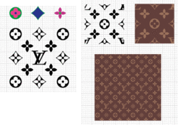
The Louis Vuitton brand and pattern is world-famous, especially among fashionistas and the hip hop community. Let's turn that brand on its head and make some POP ART by making your own custom Louis Vuitton-style pattern. Also, this will require you to make a repeating pattern that aligns like the original.
Process:
- Make a new 2in x 2in file called "2_lastname_lv2"
- Using similar colors to the original pattern, use your initials and any custom shapes you find in Photoshop's custom shape tool.
- DEFINE THE PATTERN
- Create a new file that's 8in x 8in called "2_lastname_lv8"
- Paint the pattern and BOOM! You're done!


