ESSENTIAL INFO!

TURN IN FOLDER
\\msd25-fileserver\mvms\homework in\Technology homework IN\Mr. McGehee

PICK UP FOLDER
\\msd25-fileserver\mvms\homework out\Technology homework OUT\Mr. McGehee

GOOGLE LOGIN
domain_stu@msvl.k12.wa.us

Tuesday
Oct282014

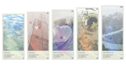
Reading and Blog Post: U.S. Money Redesign

Please visit this article on theverge.com about graphic designer Travis Purrington's design exercise on redesigning our money.  Once you have finished reading it, write a blog entry about your thoughts on the article.  

Requirements

  • Please include at least one picture of Purrington's design.
  • Include your thoughts on:
    • What do you like about the design?
    • What do you think needs changing in his design?
    • Where did Purrington get his inspiration for his design?
    • What things did Purrington remove from the artwork on money?
    • What things from our current money did he work into his design? How?
    • Do you see any things did Purrington did to help people with limited sight and the blind?
    • Where do you notice Purrington using SCALE or INVERSION?
    • If you could design money, what would you make it look like?
Monday
Oct272014

Assessment: Scale and Inversion - "Bad Kittehs"

Process:

  • Create a new folder called "kittehs"
  • Creating a document called "kittehs", that's at least 4 x 6 inches, 300 ppi (you can choose what shape and size)
  • Use the image below and the following text to show that you can use the concepts of scale and inversion to create interesting design

Text:

  • "Bad Kittehs"
  • "How yesterday's kittens go wrong" 

Click below to view the full resolution image.

Thursday
Oct232014

Blog Post: Scale!  

Typing this from the lobby of the conference today.  Please work on the blog post below or either the inversion or iscale files.  I'll see you tomorrow!  Do great work today!

Intro:

To wrap up our work on the concept of using SCALE in design, it's time to write a blog post featuring some of your work along with some words explaining what you did.

Process:

  • Post title: Using Scale in Design
  • Post JPGs of each of the following exercise files:
    • bsp1
    • bsp2
    • iscale
  • Using complete sentences, explain or answer:
    • What is scale?
    • Why does using scale matter?
    • How does using scale affect the person looking at the design?
    • How did you make the iscale file?
    • Which of your designs here is your favorite?  Why?
Wednesday
Oct222014

Extenstion Activity: Inversion and Scale


Process:

  • Make a new document that's 8 inches x 8 inches, 300ppi called "iscale"
  • PLACE on your INVERSION jpg
  • Using the MOVE TOOL, scale the image up to a HUGE size, zooming in on a tiny piece.
  • Move the image around until you think you've found a piece that you think looks interesting.
  • Make sure you don't stretch your image!  Drag at the corners, holding SHIFT when needed
  • SAVE a JPG in your "Direction" folder
  • TURN IN


Tuesday
Oct212014

Activity: Direction - Inversion

Intro:

We've discussed how the eye follows design from top to bottom and how inversion can make this interesting.  Now, let's put this to the test by creating a new piece of album art for your favorite artist.  You will find a high-res image of your artist OR an image that you think would make a good image for an album cover.

Process:

  • Make a new folder called "Direction"
  • Make a new document called "inversion" that's 4.724 inches square, 300 ppi
  • Online, find a high-res image of your artist or an image that would work well for your cover
  • SAVE this image to your "direction" folder
  • PLACE this image on your cover
  • Think of a new album name that you think would fit for your artist
  • Using the type tool, use two different types of fonts to layout both the artist name and the album title
  • Be sure to use the idea of INVERSION
  • You may use whatever effects, colors or shapes that you think would make your cover interesting or attractive
  • SAVE your JPG to the "direction" folder


Page 1 ... 3 4 5 6 7 ... 9 Next 5 Entries ยป